Principale Component Analysis (PCA)
1 Preliminary
1.1 Context
Ce TP est en lien avec l’activité Réalisez une ACP, de la partie 2 du cours Réalisez une analyse exploratoire de données.
Nous allons travailler sur le jeu de données mystère.
1.2 Imports
Nous allons importer nos librairies :
[1]:
######

# Il manque du code !

######
import numpy as np
import pandas as pd
from sklearn.decomposition import PCA
from sklearn.preprocessing import StandardScaler
import matplotlib.pyplot as plt
from matplotlib.collections import LineCollection
import seaborn as sns
import plotly.express as px
1.3 Graphics and Options
On charge seaborn :
[2]:
sns.set()
1.4 Data
Nous allons maintenant charger les données. Pour ce faire vous pouvez les retrouver sur cette page du cours.
Si vous utlisez Google Colab et que vous ne savez pas comment importer un fichier .csv, voici une vidéo à regarder à partir de 2:53
Importons notre fichier :
[3]:
df = pd.read_csv("./../../data/mystery.csv")
df
[3]:
| 0 | 1 | 2 | |
|---|---|---|---|
| 0 | -7.988979 | 15.633928 | -5.726221 |
| 1 | 0.108386 | -3.456144 | 22.272791 |
| 2 | 1.565447 | 10.915797 | 29.040207 |
| 3 | 0.765086 | 35.831929 | 20.892023 |
| 4 | -8.880745 | 20.989331 | 8.337199 |
| ... | ... | ... | ... |
| 4995 | -0.724429 | 19.077317 | -0.002715 |
| 4996 | -1.941668 | -3.481421 | 22.924661 |
| 4997 | -4.305507 | -5.330243 | 5.650440 |
| 4998 | -7.067287 | 9.422035 | 23.186741 |
| 4999 | 5.793738 | -12.591809 | 18.570849 |
5000 rows × 3 columns
1.5 Functions
Nous allons copier - coller les fonctions de notre précédent notebook.
Ces fonctions sont assez complexes. Je ne vous demande pas de les comprendre de A à Z. Essayez juste de les lire à la volée pour voir si vous les comprenez.
Si vous ne comprenez pas tout, encore une fois, cela n’est pas grave.
Pour le graphe des correlations :
[4]:
def correlation_graph(pca,
                      x_y,
                      features) :
    """Affiche le graphe des correlations

    Positional arguments :
    -----------------------------------
    pca : sklearn.decomposition.PCA : notre objet PCA qui a été fit
    x_y : list ou tuple : le couple x,y des plans à afficher, exemple [0,1] pour F1, F2
    features : list ou tuple : la liste des features (ie des dimensions) à représenter
    """

    # Extrait x et y
    x,y=x_y

    # Taille de l'image (en inches)
    fig, ax = plt.subplots(figsize=(10, 9))

    # Pour chaque composante :
    for i in range(0, pca.components_.shape[1]):

        # Les flèches
        ax.arrow(0,0,
                pca.components_[x, i],
                pca.components_[y, i],
                head_width=0.07,
                head_length=0.07,
                width=0.02, )

        # Les labels
        plt.text(pca.components_[x, i] + 0.05,
                pca.components_[y, i] + 0.05,
                features[i])

    # Affichage des lignes horizontales et verticales
    plt.plot([-1, 1], [0, 0], color='grey', ls='--')
    plt.plot([0, 0], [-1, 1], color='grey', ls='--')

    # Nom des axes, avec le pourcentage d'inertie expliqué
    plt.xlabel('F{} ({}%)'.format(x+1, round(100*pca.explained_variance_ratio_[x],1)))
    plt.ylabel('F{} ({}%)'.format(y+1, round(100*pca.explained_variance_ratio_[y],1)))

    # J'ai copié collé le code sans le lire
    plt.title("Cercle des corrélations (F{} et F{})".format(x+1, y+1))

    # Le cercle
    an = np.linspace(0, 2 * np.pi, 100)
    plt.plot(np.cos(an), np.sin(an))  # Add a unit circle for scale

    # Axes et display
    plt.axis('equal')
    plt.show(block=False)
Pour les plans factoriels :
[5]:
def display_factorial_planes(   X_projected,
                                x_y,
                                pca=None,
                                labels = None,
                                clusters=None,
                                alpha=1,
                                figsize=[10,8],
                                marker="." ):
    """
    Affiche la projection des individus

    Positional arguments :
    -------------------------------------
    X_projected : np.array, pd.DataFrame, list of list : la matrice des points projetés
    x_y : list ou tuple : le couple x,y des plans à afficher, exemple [0,1] pour F1, F2

    Optional arguments :
    -------------------------------------
    pca : sklearn.decomposition.PCA : un objet PCA qui a été fit, cela nous permettra d'afficher la variance de chaque composante, default = None
    labels : list ou tuple : les labels des individus à projeter, default = None
    clusters : list ou tuple : la liste des clusters auquel appartient chaque individu, default = None
    alpha : float in [0,1] : paramètre de transparence, 0=100% transparent, 1=0% transparent, default = 1
    figsize : list ou tuple : couple width, height qui définit la taille de la figure en inches, default = [10,8]
    marker : str : le type de marker utilisé pour représenter les individus, points croix etc etc, default = "."
    """

    # Transforme X_projected en np.array
    X_ = np.array(X_projected)

    # On définit la forme de la figure si elle n'a pas été donnée
    if not figsize:
        figsize = (7,6)

    # On gère les labels
    if  labels is None :
        labels = []
    try :
        len(labels)
    except Exception as e :
        raise e

    # On vérifie la variable axis
    if not len(x_y) ==2 :
        raise AttributeError("2 axes sont demandées")
    if max(x_y )>= X_.shape[1] :
        raise AttributeError("la variable axis n'est pas bonne")

    # on définit x et y
    x, y = x_y

    # Initialisation de la figure
    fig, ax = plt.subplots(1, 1, figsize=figsize)

    # On vérifie s'il y a des clusters ou non
    c = None if clusters is None else clusters

    # Les points
    # plt.scatter(   X_[:, x], X_[:, y], alpha=alpha,
    #                     c=c, cmap="Set1", marker=marker)
    sns.scatterplot(data=None, x=X_[:, x], y=X_[:, y], hue=c)

    # Si la variable pca a été fournie, on peut calculer le % de variance de chaque axe
    if pca :
        v1 = str(round(100*pca.explained_variance_ratio_[x]))  + " %"
        v2 = str(round(100*pca.explained_variance_ratio_[y]))  + " %"
    else :
        v1=v2= ''

    # Nom des axes, avec le pourcentage d'inertie expliqué
    ax.set_xlabel(f'F{x+1} {v1}')
    ax.set_ylabel(f'F{y+1} {v2}')

    # Valeur x max et y max
    x_max = np.abs(X_[:, x]).max() *1.1
    y_max = np.abs(X_[:, y]).max() *1.1

    # On borne x et y
    ax.set_xlim(left=-x_max, right=x_max)
    ax.set_ylim(bottom= -y_max, top=y_max)

    # Affichage des lignes horizontales et verticales
    plt.plot([-x_max, x_max], [0, 0], color='grey', alpha=0.8)
    plt.plot([0,0], [-y_max, y_max], color='grey', alpha=0.8)

    # Affichage des labels des points
    if len(labels) :
        # j'ai copié collé la fonction sans la lire
        for i,(_x,_y) in enumerate(X_[:,[x,y]]):
            plt.text(_x, _y+0.05, labels[i], fontsize='14', ha='center',va='center')

    # Titre et display
    plt.title(f"Projection des individus (sur F{x+1} et F{y+1})")
    plt.show()
Si vous avez vu des choses bizarres dans le code, pas de soucis, supprimez les lignes en question !
2 Data Preparation
Avant de nous jeter dans le grand bain, nous allons devoir étudier et préparer un peu le terrain.
2.1 Quick tour
Tout d’abord faisons un rapide tour de nos données. Commencons par les afficher :
[6]:
df.head()
[6]:
| 0 | 1 | 2 | |
|---|---|---|---|
| 0 | -7.988979 | 15.633928 | -5.726221 |
| 1 | 0.108386 | -3.456144 | 22.272791 |
| 2 | 1.565447 | 10.915797 | 29.040207 |
| 3 | 0.765086 | 35.831929 | 20.892023 |
| 4 | -8.880745 | 20.989331 | 8.337199 |
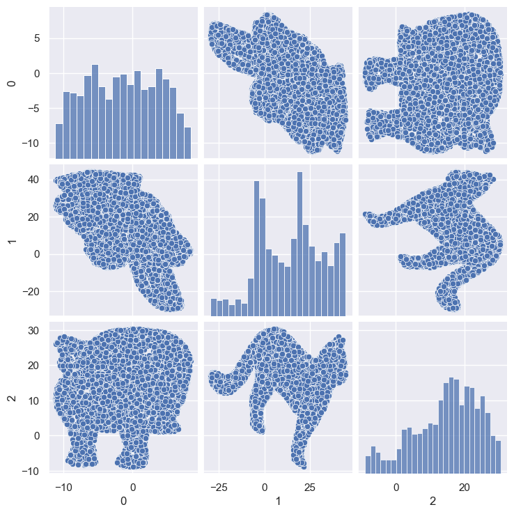
[7]:
sns.pairplot(df)
[7]:
<seaborn.axisgrid.PairGrid at 0x25fc75c2920>

Quelle est la dimension de notre dataframe?
[8]:
df.shape
[8]:
(5000, 3)
La méthode info nous donne des indications globales :
[9]:
df.info()
<class 'pandas.core.frame.DataFrame'>
RangeIndex: 5000 entries, 0 to 4999
Data columns (total 3 columns):
 #   Column  Non-Null Count  Dtype
---  ------  --------------  -----
 0   0       5000 non-null   float64
 1   1       5000 non-null   float64
 2   2       5000 non-null   float64
dtypes: float64(3)
memory usage: 117.3 KB
Quel est le % de valeurs manquantes par colonne ?
[10]:
df.isnull().mean()
[10]:
0    0.0
1    0.0
2    0.0
dtype: float64
Y a-t-il des lignes en double ?
[11]:
df.duplicated().sum()
[11]:
190
Combien y a-t-il de valeurs différentes par colonne ?
[12]:
df.nunique()
[12]:
0    4810
1    4810
2    4810
dtype: int64
Enfin la methode describe nous donne une idée de la dispertion globale de nos données :
Le dataframe est assez simple, pas de nettoyage à faire. Tant mieux!
3 About PCA
3.1 Scaling
Nous allons effectuer notre scaling. Attention toutefois, réduire n’est ici pas nécessaire car les variables sont exprimées dans la même unité.
On se contente juste de centrer les données, ce qui est obligatoire pour une ACP.
Pour ce faire, on peut utiliser l’argument with_std=False :
[13]:
scaler = StandardScaler(with_std=False)
scaler
[13]:
StandardScaler(with_std=False)In a Jupyter environment, please rerun this cell to show the HTML representation or trust the notebook.
On GitHub, the HTML representation is unable to render, please try loading this page with nbviewer.org.
StandardScaler(with_std=False)
On fit :
[14]:
######

# Il manque du code !

######
scaler.fit(df)
[14]:
StandardScaler(with_std=False)In a Jupyter environment, please rerun this cell to show the HTML representation or trust the notebook.
On GitHub, the HTML representation is unable to render, please try loading this page with nbviewer.org.
StandardScaler(with_std=False)
On transforme :
[15]:
######

# Il manque du code !

######
X = scaler.transform(df)
3.2 PCA
Nous allons travailler sur les 3 composantes :
[16]:
n_components = 3
On instancie notre ACP :
[17]:
######

# Il manque du code !

######
pca = PCA(n_components)
On l’entraine :
[18]:
######

# Il manque du code !

######
pca.fit(X)
[18]:
PCA(n_components=3)In a Jupyter environment, please rerun this cell to show the HTML representation or trust the notebook.
On GitHub, the HTML representation is unable to render, please try loading this page with nbviewer.org.
PCA(n_components=3)
3.3 Explained variance & scree plot
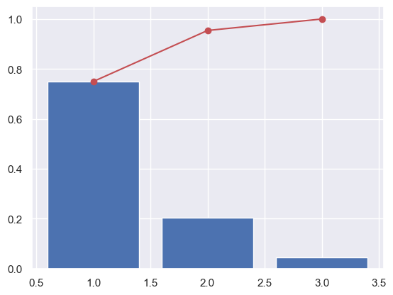
Intéressons nous maintenant à la variance captée par chaque nouvelle composante. Grace à scikit-learn on peut utiliser l’attribut explained_variance_ratio_ :
[19]:
pca.explained_variance_ratio_
[19]:
array([0.74965329, 0.20442347, 0.04592324])
Ici la 1ère composante capte 75% de la variance de nos données initiales, la 2ème 20% etc etc.
Enregistrons cela dans une variable :
[20]:
######

# Il manque du code !

######
var_ratio = pca.explained_variance_ratio_
Les 2 premières composantes captent - à elles seules - 75+20 = 95% de la variance!!!
Dans le jargon, cela s’appelle une somme cumulée. Et pour faire une somme cumulée numpydispose de la fonction cumsum :
[21]:
######

# Il manque du code !

######
var_ratio_cum = np.cumsum(var_ratio)
Définisions ensuite une variable avec la liste de nos composantes :
[22]:
x_list = range(1, n_components+1)
list(x_list)
[22]:
[1, 2, 3]
On peut enfin l’afficher de façon graphique :
[23]:
######

# Il manque du code !

######
plt.figure()
plt.bar(x_list, var_ratio, data=var_ratio)
plt.plot(x_list, var_ratio_cum, 'ro-')
[23]:
[<matplotlib.lines.Line2D at 0x25fec7a3160>]
[24]:
plt.bar??
Signature:
plt.bar(
    x: 'float | ArrayLike',
    height: 'float | ArrayLike',
    width: 'float | ArrayLike' = 0.8,
    bottom: 'float | ArrayLike | None' = None,
    *,
    align: "Literal['center', 'edge']" = 'center',
    data=None,
    **kwargs,
) -> 'BarContainer'
Docstring:
Make a bar plot.

The bars are positioned at *x* with the given *align*\ment. Their
dimensions are given by *height* and *width*. The vertical baseline
is *bottom* (default 0).

Many parameters can take either a single value applying to all bars
or a sequence of values, one for each bar.

Parameters
----------
x : float or array-like
    The x coordinates of the bars. See also *align* for the
    alignment of the bars to the coordinates.

height : float or array-like
    The height(s) of the bars.

    Note that if *bottom* has units (e.g. datetime), *height* should be in
    units that are a difference from the value of *bottom* (e.g. timedelta).

width : float or array-like, default: 0.8
    The width(s) of the bars.

    Note that if *x* has units (e.g. datetime), then *width* should be in
    units that are a difference (e.g. timedelta) around the *x* values.

bottom : float or array-like, default: 0
    The y coordinate(s) of the bottom side(s) of the bars.

    Note that if *bottom* has units, then the y-axis will get a Locator and
    Formatter appropriate for the units (e.g. dates, or categorical).

align : {'center', 'edge'}, default: 'center'
    Alignment of the bars to the *x* coordinates:

    - 'center': Center the base on the *x* positions.
    - 'edge': Align the left edges of the bars with the *x* positions.

    To align the bars on the right edge pass a negative *width* and
    ``align='edge'``.

Returns
-------
`.BarContainer`
    Container with all the bars and optionally errorbars.

Other Parameters
----------------
color : color or list of color, optional
    The colors of the bar faces.

edgecolor : color or list of color, optional
    The colors of the bar edges.

linewidth : float or array-like, optional
    Width of the bar edge(s). If 0, don't draw edges.

tick_label : str or list of str, optional
    The tick labels of the bars.
    Default: None (Use default numeric labels.)

label : str or list of str, optional
    A single label is attached to the resulting `.BarContainer` as a
    label for the whole dataset.
    If a list is provided, it must be the same length as *x* and
    labels the individual bars. Repeated labels are not de-duplicated
    and will cause repeated label entries, so this is best used when
    bars also differ in style (e.g., by passing a list to *color*.)

xerr, yerr : float or array-like of shape(N,) or shape(2, N), optional
    If not *None*, add horizontal / vertical errorbars to the bar tips.
    The values are +/- sizes relative to the data:

    - scalar: symmetric +/- values for all bars
    - shape(N,): symmetric +/- values for each bar
    - shape(2, N): Separate - and + values for each bar. First row
      contains the lower errors, the second row contains the upper
      errors.
    - *None*: No errorbar. (Default)

    See :doc:`/gallery/statistics/errorbar_features` for an example on
    the usage of *xerr* and *yerr*.

ecolor : color or list of color, default: 'black'
    The line color of the errorbars.

capsize : float, default: :rc:`errorbar.capsize`
   The length of the error bar caps in points.

error_kw : dict, optional
    Dictionary of keyword arguments to be passed to the
    `~.Axes.errorbar` method. Values of *ecolor* or *capsize* defined
    here take precedence over the independent keyword arguments.

log : bool, default: False
    If *True*, set the y-axis to be log scale.

data : indexable object, optional
    If given, all parameters also accept a string ``s``, which is
    interpreted as ``data[s]`` (unless this raises an exception).

**kwargs : `.Rectangle` properties

Properties:
    agg_filter: a filter function, which takes a (m, n, 3) float array and a dpi value, and returns a (m, n, 3) array and two offsets from the bottom left corner of the image
    alpha: scalar or None
    angle: unknown
    animated: bool
    antialiased or aa: bool or None
    bounds: (left, bottom, width, height)
    capstyle: `.CapStyle` or {'butt', 'projecting', 'round'}
    clip_box: `~matplotlib.transforms.BboxBase` or None
    clip_on: bool
    clip_path: Patch or (Path, Transform) or None
    color: color
    edgecolor or ec: color or None
    facecolor or fc: color or None
    figure: `~matplotlib.figure.Figure`
    fill: bool
    gid: str
    hatch: {'/', '\\', '|', '-', '+', 'x', 'o', 'O', '.', '*'}
    height: unknown
    in_layout: bool
    joinstyle: `.JoinStyle` or {'miter', 'round', 'bevel'}
    label: object
    linestyle or ls: {'-', '--', '-.', ':', '', (offset, on-off-seq), ...}
    linewidth or lw: float or None
    mouseover: bool
    path_effects: list of `.AbstractPathEffect`
    picker: None or bool or float or callable
    rasterized: bool
    sketch_params: (scale: float, length: float, randomness: float)
    snap: bool or None
    transform: `~matplotlib.transforms.Transform`
    url: str
    visible: bool
    width: unknown
    x: unknown
    xy: (float, float)
    y: unknown
    zorder: float

See Also
--------
barh : Plot a horizontal bar plot.

Notes
-----
Stacked bars can be achieved by passing individual *bottom* values per
bar. See :doc:`/gallery/lines_bars_and_markers/bar_stacked`.
Source:
@_copy_docstring_and_deprecators(Axes.bar)
def bar(
    x: float | ArrayLike,
    height: float | ArrayLike,
    width: float | ArrayLike = 0.8,
    bottom: float | ArrayLike | None = None,
    *,
    align: Literal["center", "edge"] = "center",
    data=None,
    **kwargs,
) -> BarContainer:
    return gca().bar(
        x,
        height,
        width=width,
        bottom=bottom,
        align=align,
        **({"data": data} if data is not None else {}),
        **kwargs,
    )
File:      c:\users\nicolaseby\documents\github\data_science\venv\lib\site-packages\matplotlib\pyplot.py
Type:      function
On a en bleu la variance de chaque nouvelle composante, et en rouge la variance cumulée.
On voit ici que près de 95% de la variance est comprise dans les 2 premières composantes. En clair, la 3e composante n’est pas très utile…
3.4 Components
Intéressons nous maintenant à nos fameuses composantes. Nous avons dit dans le cours que c’est bien par un calcul que l’on obtient ces composantes.
La formule de ce calcul nous est donnée par l’attribut components_. Cette variable est généralement nommée pcs :
[25]:
######

# Il manque du code !

######
pcs = pca.components_
pcs
[25]:
array([[ 0.15580956, -0.98750579, -0.02357312],
       [-0.06045988,  0.01428585, -0.99806839],
       [-0.98593508, -0.15693382,  0.05747861]])
Affichons la même chose mais version pandas :
[26]:
pcs = pd.DataFrame(pcs)
pcs
[26]:
| 0 | 1 | 2 | |
|---|---|---|---|
| 0 | 0.155810 | -0.987506 | -0.023573 |
| 1 | -0.060460 | 0.014286 | -0.998068 |
| 2 | -0.985935 | -0.156934 | 0.057479 |
Intéressant… Mais pas encore très clair… Continuons le travail :
[27]:
pcs.columns = df.columns
pcs.index = [f"F{i}" for i in x_list]
pcs.round(2)
[27]:
| 0 | 1 | 2 | |
|---|---|---|---|
| F1 | 0.16 | -0.99 | -0.02 |
| F2 | -0.06 | 0.01 | -1.00 |
| F3 | -0.99 | -0.16 | 0.06 |
De mieux en mieux !
– ATTENTION – : Nous avons arrondi les résultats pour simplifier l’analyse :)
Alors, comment calcule t-on la première composante F1 ?
et bien c’est assez simple :
F1 = (0.16 * x) + (-0.99 * y) + (0.02 * z)
et F2 ?
F2 = (-0.06 * x) + (-0.01 * y) + (-1.0 * z)
Eureka !
Dans certains cas, on voudra afficher ce dataframe comme cela :
[28]:
pcs.T
[28]:
| F1 | F2 | F3 | |
|---|---|---|---|
| 0 | 0.155810 | -0.060460 | -0.985935 |
| 1 | -0.987506 | 0.014286 | -0.156934 |
| 2 | -0.023573 | -0.998068 | 0.057479 |
Et pour une représentation plus visuelle, comme cela :
[29]:
sns.heatmap??
Signature:
sns.heatmap(
    data,
    *,
    vmin=None,
    vmax=None,
    cmap=None,
    center=None,
    robust=False,
    annot=None,
    fmt='.2g',
    annot_kws=None,
    linewidths=0,
    linecolor='white',
    cbar=True,
    cbar_kws=None,
    cbar_ax=None,
    square=False,
    xticklabels='auto',
    yticklabels='auto',
    mask=None,
    ax=None,
    **kwargs,
)
Source:
def heatmap(
    data, *,
    vmin=None, vmax=None, cmap=None, center=None, robust=False,
    annot=None, fmt=".2g", annot_kws=None,
    linewidths=0, linecolor="white",
    cbar=True, cbar_kws=None, cbar_ax=None,
    square=False, xticklabels="auto", yticklabels="auto",
    mask=None, ax=None,
    **kwargs
):
    """Plot rectangular data as a color-encoded matrix.

    This is an Axes-level function and will draw the heatmap into the
    currently-active Axes if none is provided to the ``ax`` argument.  Part of
    this Axes space will be taken and used to plot a colormap, unless ``cbar``
    is False or a separate Axes is provided to ``cbar_ax``.

    Parameters
    ----------
    data : rectangular dataset
        2D dataset that can be coerced into an ndarray. If a Pandas DataFrame
        is provided, the index/column information will be used to label the
        columns and rows.
    vmin, vmax : floats, optional
        Values to anchor the colormap, otherwise they are inferred from the
        data and other keyword arguments.
    cmap : matplotlib colormap name or object, or list of colors, optional
        The mapping from data values to color space. If not provided, the
        default will depend on whether ``center`` is set.
    center : float, optional
        The value at which to center the colormap when plotting divergent data.
        Using this parameter will change the default ``cmap`` if none is
        specified.
    robust : bool, optional
        If True and ``vmin`` or ``vmax`` are absent, the colormap range is
        computed with robust quantiles instead of the extreme values.
    annot : bool or rectangular dataset, optional
        If True, write the data value in each cell. If an array-like with the
        same shape as ``data``, then use this to annotate the heatmap instead
        of the data. Note that DataFrames will match on position, not index.
    fmt : str, optional
        String formatting code to use when adding annotations.
    annot_kws : dict of key, value mappings, optional
        Keyword arguments for :meth:`matplotlib.axes.Axes.text` when ``annot``
        is True.
    linewidths : float, optional
        Width of the lines that will divide each cell.
    linecolor : color, optional
        Color of the lines that will divide each cell.
    cbar : bool, optional
        Whether to draw a colorbar.
    cbar_kws : dict of key, value mappings, optional
        Keyword arguments for :meth:`matplotlib.figure.Figure.colorbar`.
    cbar_ax : matplotlib Axes, optional
        Axes in which to draw the colorbar, otherwise take space from the
        main Axes.
    square : bool, optional
        If True, set the Axes aspect to "equal" so each cell will be
        square-shaped.
    xticklabels, yticklabels : "auto", bool, list-like, or int, optional
        If True, plot the column names of the dataframe. If False, don't plot
        the column names. If list-like, plot these alternate labels as the
        xticklabels. If an integer, use the column names but plot only every
        n label. If "auto", try to densely plot non-overlapping labels.
    mask : bool array or DataFrame, optional
        If passed, data will not be shown in cells where ``mask`` is True.
        Cells with missing values are automatically masked.
    ax : matplotlib Axes, optional
        Axes in which to draw the plot, otherwise use the currently-active
        Axes.
    kwargs : other keyword arguments
        All other keyword arguments are passed to
        :meth:`matplotlib.axes.Axes.pcolormesh`.

    Returns
    -------
    ax : matplotlib Axes
        Axes object with the heatmap.

    See Also
    --------
    clustermap : Plot a matrix using hierarchical clustering to arrange the
                 rows and columns.

    Examples
    --------

    .. include:: ../docstrings/heatmap.rst

    """
    # Initialize the plotter object
    plotter = _HeatMapper(data, vmin, vmax, cmap, center, robust, annot, fmt,
                          annot_kws, cbar, cbar_kws, xticklabels,
                          yticklabels, mask)

    # Add the pcolormesh kwargs here
    kwargs["linewidths"] = linewidths
    kwargs["edgecolor"] = linecolor

    # Draw the plot and return the Axes
    if ax is None:
        ax = plt.gca()
    if square:
        ax.set_aspect("equal")
    plotter.plot(ax, cbar_ax, kwargs)
    return ax
File:      c:\users\nicolaseby\documents\github\data_science\venv\lib\site-packages\seaborn\matrix.py
Type:      function
[30]:
######

# Il manque du code !

######
plt.figure(figsize=(10,5))
sns.heatmap(pcs.T, vmin=-1, vmax=1, cmap="coolwarm", annot=True)
[30]:
<Axes: >
F1+F2 =95% de la variance. * F1 = -y + 'un peu' de x et F2 = z3.5 Correlation graph
Pour la partie graphique, nous allons utiliser les fonctions vues dans la section 1.5.
Définissons nos axes x et y. Nous allons utiliser les 2 premières composantes. Comme - en code - on commence à compter à partir de 0, cela nous donne :
[31]:
x, y = 0,1
[32]:
######

# Il manque du code !

######
correlation_graph(pca, (x,y), list(df.columns))
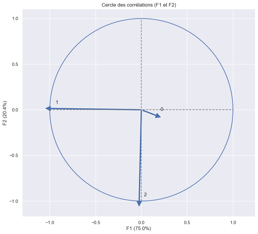
Conclusion : F1 est principalement composée de -y et F2 de -z.
3.6 Projection
Travaillons maintenant sur la projection de nos dimensions. Tout d’abord calculons les coordonnées de nos individus dans le nouvel espace :
[33]:
######

# Il manque du code !

######
X_projected = pca.transform(X)
On rappelle que :
[34]:
x, y
[34]:
(0, 1)
[35]:
x_y = x, y
x_y
[35]:
(0, 1)
Essayons avec F1 et F2 :
[36]:
######

# Il manque du code !

######
display_factorial_planes(   X_projected,
                            x_y
                        )
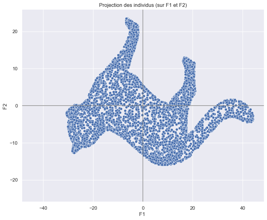
Ohhhh … Un chat !
Essayons avec F1 et F3 :
[37]:
x_y = [0,2]

######

# Il manque du code !

######

display_factorial_planes(   X_projected,
                            x_y
                        )
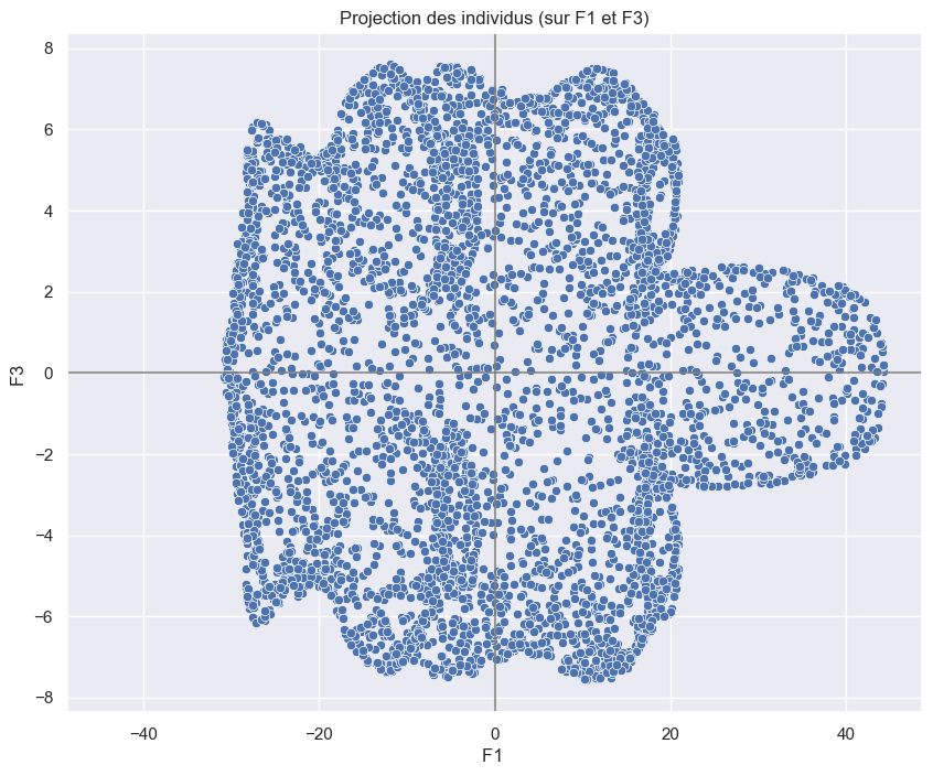
Un chat vue de dessous ?
[38]:
x_y = [1,2]

######

# Il manque du code !

######
display_factorial_planes(   X_projected,
                            x_y
                        )
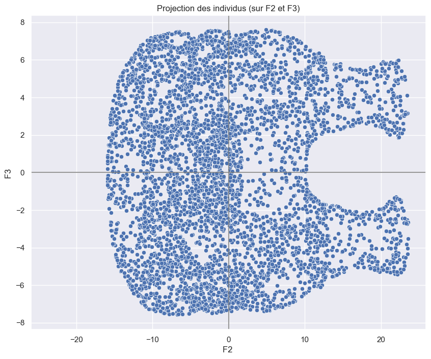
Un chat vue de derrière ?
[39]:
sns.pairplot(df)
[39]:
<seaborn.axisgrid.PairGrid at 0x25fea28b4f0>